Today, we’re finishing up our tour of the DVD cover design process. It’s been a while but the DVD cover has been approved and I am finally at liberty to reveal the finished design!
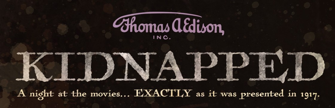
I shared my inspirations for the cover design and then discussed color and typefaces. Finally, I talked about antiquing and distressing images. Now it’s time to put it all together in the final design. This design is for my upcoming DVD release of the 1917 version of Kidnapped.
Stills
One of the biggest challenges for this project was tracking down quality images. I don’t mean to be rude but Edison’s marketing department kind of left a lot to be desired on that score. Their ads were a bit… meh.
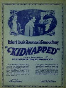
Fortunately, they did take some very nice stills and I was able to obtain quality scans for the project!
(When using stills for the cover, you need to make sure that you have the proper licenses and permission. Permission and rights are a complicated subject and my only advice is to contact the archive and tell them, with as many specifics as possible, how you plan to use the image and give a ballpark estimate of how many copies will be distributed. They can assist you with pricing and other information from there. Sorry I can’t be more specific but it really does vary.)
Layout
The still I decided on was portrait (as opposed to landscape), so there wasn’t much cropping to be done. However, DVDs have a back cover area. As mentioned in earlier articles, I wanted to use a subtle stripe pattern as a nod to classic ad design.
Aaaand, here it is!
The cover image is courtesy of the Museum of Modern Art.
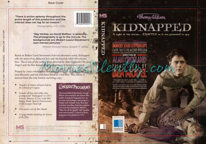
I included the template layer so that you can see that
There are certain design elements that have to be placed just so. The copyright information traditionally goes on the bottom of the back, of course. The barcode goes on the upper right corner of what will be the DVD back. The Library of Congress logo is to be placed on the disc spine and be prominently featured as the source of the prints.
And of course, there is important information to be included. Which films are on the DVD, the format in which they are preserved, my logo, Ben Model must be credited as the accompanist, etc.
In short, a LOT of musts.
Splatters

Because I have a dark cover image but wanted to use a light background on the back, I used distressing and splatters to soften the edge between the dark and light images. I also distressed the text box on the back of the cover. Distressing also helped with parts of the cover image that were too bright and drew the eye away from where I wanted it to go.
Colorization
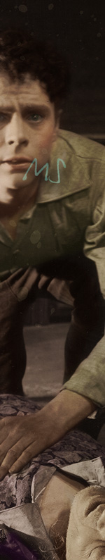
I also colorized the cover image. As stated before, my goal is not to replicate a color photo but to imitate the added color that was applied to photographs and film in 1917. I chose to keep my palette subtle with brown and green from Raymond McKee and purple for his unconscious uncle. I also made sure to keep Ray’s cheeks rosy as colorists of the period tended to apply color to the cheeks and lips of men and women alike.
Yipes! Stripes!

I created the stripe pattern myself and used the colors that were featured on the cover: purples and greens. The colors are VERY light because I wanted to avoid a Magical Mystery Tour look. Naturally, I also distressed it.
By the way, the ad blurbs on the back cover are authentic quotes from 1917 reviews of the picture.
Text Box
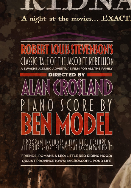
The composition of the still made a text box a natural choice for displaying information like the director, accompanist and content. I used a wet, splattery Photoshop brush to darken up any bits of the still that were making the text box difficult to read and added some subtle distressing.

The typography of the Conquest headline is taken from an original ad.
And that’s it! I hope you enjoyed the tour of DVD cover design. Once I deliver the film to my Kickstarter backers, I will be making it available for sale on Amazon. I will make an announcement once it is ready for purchase.
A huge thanks to Ben Model and Steve Massa for helping me track down stills.
***
Like what you’re reading? Please consider sponsoring me on Patreon. All patrons will get early previews of upcoming features, exclusive polls and other goodies.

Eagerly awaiting when this DVD ships! Looking good!
Thanks so much! It won’t be long (I’ll be posting a Kickstarter update very soon)
Looks good. Regarding copyright: I once attended a session conducted by a copyright lawyer who specialised in media. She ran a scene from an Australian feature film and challenged us all to spot items requiring copyright clearance. A ‘can of worms.’ And I’d had that responsibility for a number of productions.
Somewhere out there are some of mine where attempts to clear copyright just didn’t happen; it was very, very difficult in pre e-mail days, and when US copyright agencies were unresponsive to negotiations from some country (Australia) that they didn’t understand to have a film or TV industry. Music was the worst and the reason that commissioning scores was always the best path.
Oh definitely! Investing in a talented accompanist makes all the difference between a meh DVD release and a great one. My source material is 16mm, which makes a strong score all the more important. Music copyright really is the wild west here, even with stuff that is generally reckoned to be in the public domain.
I just had a memory of scoring the TV series ‘Skippy’ (yeah the kangaroo). The producers, being frugal, scored the first 13 episodes only, and the editors had to re-use those cues for later episodes. One editor became so desperate that he ran a cue backwards for an ‘eery’ scene.
Ha! Yes, I can see how that would be a problem.
Looks great, Fritzi! I love the lines from the critics!! That’s an amazing touch!
Thanks so much! I just love the way they phrased things back then and tried to use their wording wherever possible.
Terrific post on the “how-to’s of DVD cover design. When you break it down into tasks, you can easily see how much effort and careful though went into this cleverly designed project! Thanks for sharing it with us, and we all look forward to the finished product!
Thanks so much!
Wonderful cover, Fritzi! Really looking forward to the DVD!
Thanks so much!
You do not need to clear copyright for anything pre-1923 because it is public domain, and even post-1923, two Federal Appeal courts have ruled that publicity stills are in the public domain because:
1) studios never copyrighted them with the copyright office
2) they sent out tens of thousands to every magazine/newspaper in the country, with MGM proudly noting that WIZARD OF OZ stills had been seen by millions before release. I can send you the links if you want, and have even had lawyers tell me that they second Appeals Court ruling would allow anyone to put a publicity still on a T-shirt without getting any kind of permission.
That’s true but there are access requirements for the archive that holds the physical still. While the 1917 stills themselves may be out of copyright (or never in), they are physically held by their respective archives, which have the right to ask for a fee and a specific image credit. The same goes for the film itself: while it is from 1917 and out of copyright, my access agreement with the Library of Congress requires that they be credited in a particular way on all materials related the this release. (Which, of course, I am happy to do.)
Great cover! Enjoyed reading about the creative process. I’ll never look at a DVD cover the same way again!
Glad you had a good time!
This cover looks amazing! Makes me want to order half a dozen copies of Kidnapped/shorts as gifts for family and friends on the strength of the cover alone…which we most certainly will 😀
Yay! Thank you so much!
This is no easy feat! I love it!! It has the aged appearance but your eye immediately goes to the man and then down to the Uncle. The subtle colour is perfect and I like the back as well which flows well with the front because of the distress ink.
Thanks so much!
Lovely cover. Were you ever able to determine the NY/NJ filming locations for this movie? I had just been wondering about that.
Thanks! We’re not 100% confirmed but Chris Bird makes a very good case for Paterno and Libbey Castles. I have no written confirmation and both castles have been demolished but I agree with the theory. It would have gone along with George Kleine’s thrifty production style to keep everything in New York and New Jersey. (The boat scenes are confirmed to be shot in Sandy Hook, NJ.)
I am in awe of your professionalism and excellent taste. What a beautiful piece of work!
🙂