Let me continue the tour of the process of creating a cover for a silent movie on DVD. Last time, I shared my inspirations for the cover design. This time, we’re getting down to brass tacks and discussing color and typefaces.
My goal, if you will recall, was to create a cover that looked like it had been created in 1917, the year Kidnapped was originally released. However, I decided not to restrict myself to typefaces available in that year, I made full use of my modern collection but I did try to stay in the general spirit of the era.
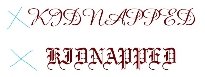
Problem #1 was deciding on which typeface to use for the title. The word “Kidnapped” is not particularly aesthetically pleasing and it has awkward off-center descenders.

Because of this, I needed something that would look good in all upper case. This presents a challenge as a great number of available fonts are pretty dire in all upper case. When you use all caps for most script and Ye Olde Englishe fonts, a designer somewhere falls down dead. (Please clap to save the designers! Clap!)

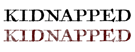
I tested out dozens of fonts but the one that won me over was Antiquarian. It’s readable, looks great in upper case and has an old school vibe that evokes the eighteenth century setting of Kidnapped.

It also lends itself well to antiquing and distressing, something I will discuss further in another post. And that K is gorgeous! I am in love!
Where was I? Oh yes, type design.
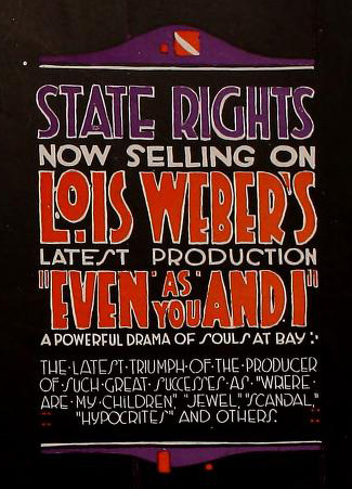
I also wanted a little box of text highlighting the film’s director, the new Ben Model score commissioned for the release and other pertinent details. I really liked this text box from a 1917 Lois Weber film. Both the design and colors appealed to me enormously. Tomato red and plum are not a combination I use often but they really evoke the period.


I have to admit that I also had a bit of fun breaking design rules. Outlined text is a major design faux pas these days (fair enough, it has been abused and looks awful nine times out of ten) and the mixing of typefaces is generally frowned on. Clean is king and so indulging in such a baroque style felt very naughty indeed. I regret nothing.
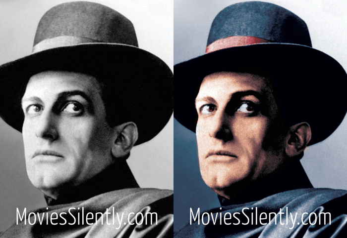
Finally, I have licensed an image from the Museum of Modern Art for my cover and it came with a pretty sepia tone but I opted to hand-color (via Photoshop) as many ads of 1917 use the technique.
Recoloring old photos is a bit controversial and I understand. Many of the colorizations are eyeball-searing while others muddy the historical record. I have already seen colorized photos being passed off as authentic old-timey color.
I prefer a more painterly approach, one that doesn’t hide the artificiality of the color. I am on solid historical ground here, as proven by this charmingly hand-colored photo of my grandfather. He was born in 1918 so this picture is from 1920 or thereabouts:

The photo that I licensed has a darker aesthetic but the basic technique is what I am after. Splashes of background color, not too much worry about staying in the lines, etc. Very freewheeling and charming.
Here’s a colorization that I did for a Judex still. I think my style has improved since then but you get the idea of what I like: old fashioned colors and no attempt at realism.

That’s all for today! Next time, I’ll be discussing the process of antiquing and adding texture to a design.
***
Like what you’re reading? Please consider sponsoring me on Patreon. All patrons will get early previews of upcoming features, exclusive polls and other goodies.

Hi Fritzi. I was happy to see you break the font rules with that text box. I don’t see the point of having rules if we can’t creatively fracture them now and then.
Design rebels unite! 😉
Not so much of a comment on the story (although it was nice). But today was a busy day at work. Somewhat stressful. Then, in the afternoon my phone sounds with an e-mail from Fritzi with today’s silent film writing. So, for a few minutes I get to take a very nice mental break and read/think about silent films. The break was needed and it helped. Thanks Fritiz!
Aww, I’m so glad you found it helpful and that it made your day better.
The hand-colored photo of your grandfather (such a cute little tyke) made me go into the old family trunks to have a look once again at my grandparents’ wedding photograph. Lovely shades of hand coloring and not a bit faded after all this time- thanks for the memories!
Also found two photogravures my great-uncle had made of Sainte Anne de Beaupré. He was quite the camera enthusiast throughout his life and experimented with all sorts of techniques.
Really like that tomato red and plum lettering combo. It definitely draws the eye!
How beautiful! Yes, there are some real little masterpieces in those old colored photos.
I love design, so I’m finding these posts really fascinating!
I never attempted to colour a picture on photoshop, must attempt it. I’ve seen plenty of digital artists do it with their b/w drawings and it always looks fun. But it’s true that most colorizations of photos look awful…
Thanks for sharing your process, looking forward to the next one 😊
Glad you’re enjoying! Yes, I have to confess to not liking much on the colorization front.