
Let me continue the tour of the process of creating a cover for a silent movie on DVD. I shared my inspirations for the cover design and then discussed color and typefaces. This time, we’re going to look at the process of distressing and generally making the thing look like a real antique.
Adding texture to your design is the best way to make it look old and that was the path I decided to take with my cover. I’m not going to get too techy in this post but Photoshop offers numerous ways to overlay a paper texture onto an image. It’s pretty great.
If you want a really nice old paper texture for your project, the best thing you can do it go out and find your own in the physical world. Libraries, thrift stores and eBay have lots of old books with beautiful old paper for the scanning. I prefer papers that are stained or “foxed” with brown spots. Let’s not do things by halves!
Remember a few posts back when I said I wanted to bring stripes into the design? This is where they come into the picture. I didn’t want to go too crazy with stripes because they tend to dominate the design and I have a nice still to take center stage so here is my solution:
I used tans and purples and a bit of green for accent all overlaid on an antique paper texture from a period fan magazine. Note the foxing!
Antiquing involves distressing the image to make it look like it has been around the block a few times. There are distress-o-matic filters and such but I don’t think they look very good.
My secret method is pretty dull: Textured brushes (frankly, the default Photoshop ones work for me in most cases), and lots and lots of layers that use lots and lots of layer masks, blending modes and opacity levels. I just do it all by eye and add more splashes and scratches and stains as I see fit. It’s not glamorous or instant but it yields pretty good results, I think. Like I said, I’m not getting too techy here because this series is aimed squarely at Jane Q. Public.
Here’s a sample of my method. This is a rough quickie, it only uses seven layers, but you get the idea of what adding paper texture and some brush work can do. For a more elaborate project like this DVD cover, I will have dozens of layers of antiquing.
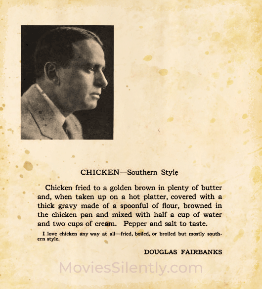
Also, I don’t recommend chicken a la Fairbanks unless you have a very good metabolism.
Distressing has to also take into account readability. You don’t want a big stain right across the main text, for example, so buffing out that stain or using a lighter color may be the solution.
In general, the best advice I can give is to study real antique papers and see how they decay. Yes, that’s right, I told you to go look at decaying papers. Isn’t being an old movie nerd fun? But the problem is that some antiqued stuff looks like a copy of a copy of a film prop. It always pays to go directly to the source.
Whew! I hope this was fun for you. Next time, we’ll take a look at combining our research, colors, fonts, textures and distress chops to create the DVD cover.
***
Like what you’re reading? Please consider sponsoring me on Patreon. All patrons will get early previews of upcoming features, exclusive polls and other goodies.

Fritzi, For some reason I find these posts about designing a case for a DVD fascinating. Keep them coming!
Yay!
I’m loving this series! It’s like a typography and design lesson, but much more interesting! Because being an old movie nerd is so much fun that most people don’t understand it 😉
Kisses!
Thank you!
I try to create an antique look on my card every once in a while. I like the stripes…softness with an old look to it. My mom really knew how to make things look antique.
Very nice!
I do not wish to know about foxing. Pleased to be offered advice re un foxing though. I know, I know: no books near outside walls, but sometimes it seems inherent in the paper.
I can digitally unfox but am helpless in the physical world, alas
Fritzi-thank you so much for sharing all of this valuable information with us! How do you know so much about all of this? Do you have a professional background in graphic arts/design? I appreciate your knowledge base so much! I will take a deep breath and stop gushing for now. It’s very cool to understand your research and the practical techniques of this project put into action.
I happy you found it useful! Yes, I am a graphic designer by day, though I usually specialize in catalogs and merchandise sheets, things like that. It’s fun to do something when I am the boss. 🙂