
I am a graphic designer in my day job and I am particularly interested in replicating vintage looks. As a result, I pay close attention to the typefaces used in silent film restorations… and some of them are not so good.
That’s why I was particularly tickled to see this piece on the restoration of The Good Bad Man, a fun Douglas Fairbanks adventure-comedy with a western theme. Published back in 2014, it tells the story of how the San Francisco Silent Film Festival approached a graphic designer to create lettering based on the unique style of silent film title cards.
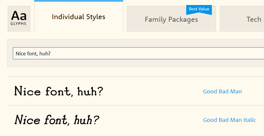
Now if you look at a lot of alleged “silent film fonts” you will see that many try too hard to look old-timey and, frankly, they are visual nails on a chalkboard. Because it is based on authentic title cards, the Good Bad Man font is true to the period, readable and attractive. Be still, my little typography nerd heart!
You can get the font here and the film was recently released on DVD and Bluray by Kino Lorber, so you can enjoy the hard work of designer Chank Diesel in multiple formats.
Many title cards were indeed in “speedball” lettering, as the article brings out, but there was more to it and the lettering often included drop caps and attractive flourishes, especially in the 1910s.
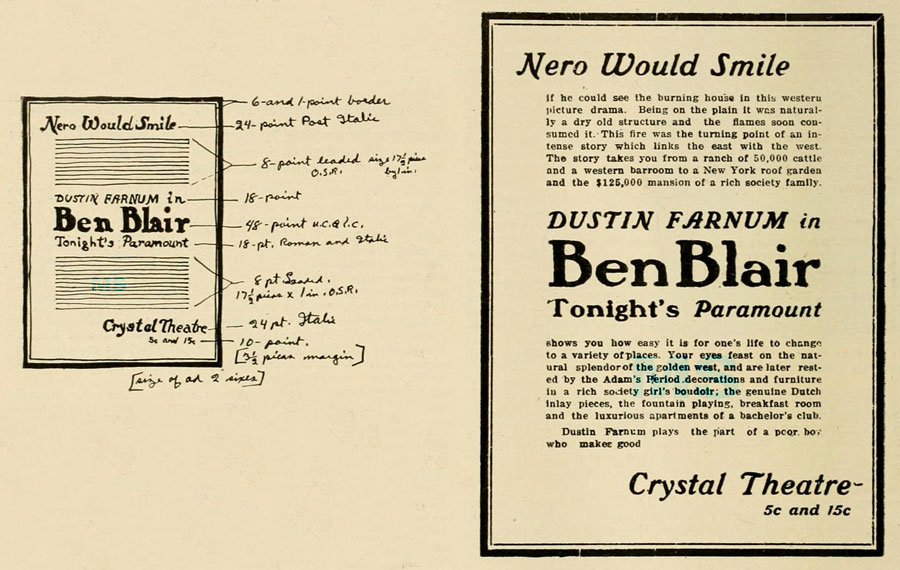
Theater advertisements were similarly elaborate and they had their own requirements. A 1917 piece in Moving Picture World detailed the woes of a theater owner getting ads printed. Apparently, the printer kept trying to foist Cloister off on him! (It’s one of the “ye Olde Englyshe” typefaces favored by bikers and teenagers with Waterhouse prints on their walls.) He often ended up using Caslon (an attractive and steady serif font) for his advertising.
In 1918, Motion Picture News recommended that motion picture ads use Gothic, Cheltenham, DeVinne, Jensen and Caslon as these typefaces were to be found at any newspaper office. (Type had to be physically purchased, of course, and so selecting one was considerably more difficult than downloading and clicking a button.)

Pretty simple, huh? The silent era was not entirely made up of Art Nouveau and Art Deco, as it turns out. (Though you’d never know it from some of the fake title cards and artwork out there.)
And, of course, we cannot neglect the notion of smaller theaters hiring their cousin’s kid who can “draw real good” to create advertisements. When I see faked silent era posters, the most common giveaway is the lack of a hand-crafted look, a look that was present even in the ads of large studios. (Come to think of it, that’s my issue with many ersatz modern silent films as well.)
Really, there’s no substitute for watching the real deal, studying and appreciating the workmanship that went into the production, from the sets and costumes down to the hand-lettered title cards.
Fortunately, many of the styles used in the silent era are right at your fingertips, they’re classics for a reason. So, go and have fun with this information but if I catch you using Comic Sans, I will not be responsible for my actions.

I first came across the Cheltenham font in Walter Kerr’s book THE SILENT CLOWNS. Ever since then, I’ve always associated that font with silent movies.
Cheltenham is gorgeous. I particularly like the lower case g. 😀
I like the wooden type that was used quite late in pre digital setting days.
I understand,from talking to a veteran typesetter, that they were employed when very large point sizes were required; newspaper posters being an example.
I found some in a curio shop that were not so large but a nice gift, spelling out the recipient’s name.
My second job was as a copyholder at a weekly news magazine; the Linotype and compositors’ room in the basement was wondrous. It was wise to be on good terms with the ‘Father of the Chapel’ as the supervisor, and usually union representative was called.
Very cool!