The French Gaumont company showcased their new Chronochrome motion pictures with simple images of fruit and flowers on a turntable. These films are simple but the bold, assertive colors are as impressive today as they were when they were first displayed.
Home Media Availability: Released on DVD.
Toe-may-toe toe-mah-toe
There were two ways to achieve color films during the silent era: color could be applied to the print using dyes that were painted, stamped, stencil, etc. or a “natural” color process could capture the hues as the film was shot. The former was more common by far—it was applied with impressive precision and the palette was vast, plus no special projector was needed to run it— but natural color was something of a holy grail for silent era filmmakers with serious research launching in the nineteenth century.
Most of the color processes, from pioneering Kinemacolor to early Technicolor, had great difficulty capturing and replicating blue. In fact, most natural color was created by mixing shades of red and green and even though two of the most famous silent full color features—The Toll of the Sea and The Black Pirate— were all about the ocean, the water was distinctly teal.
So, my first time seeing Gaumont’s Chronochrome process was something of a revelation. Here was a pre-WWI natural color process that captured and projected a deep and vivid blue. Flowers and Fruits were two short snippets designed to showcase the color process to audiences and it crossed the Atlantic with considerable fanfare in 1913. (The exact date of Flowers and Fruits is somewhere in the 1912-1913 range.)
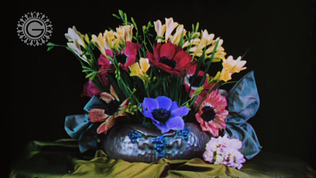
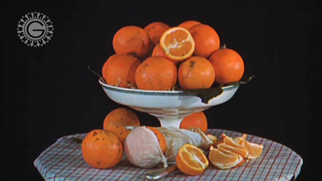
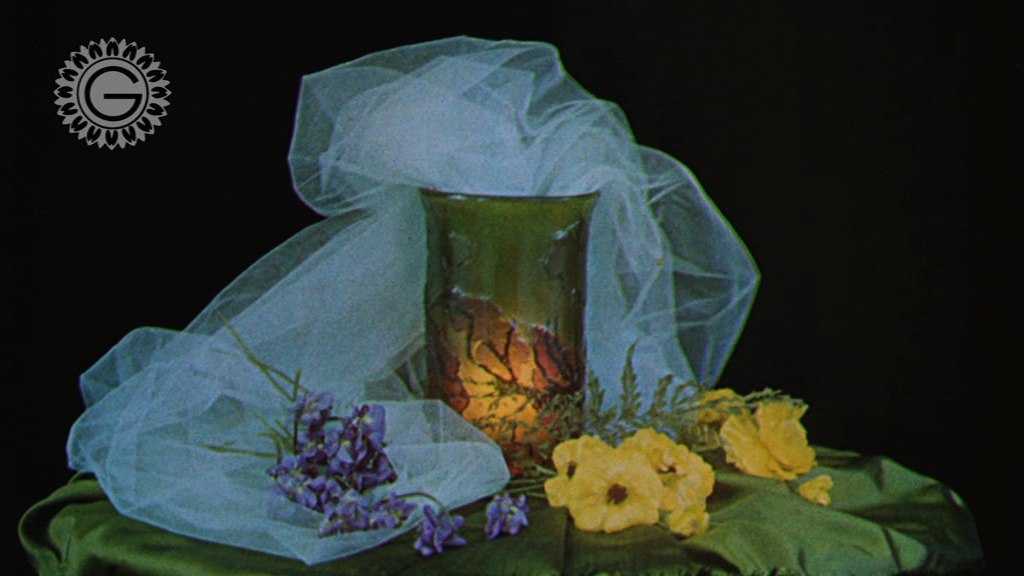
Flowers and Fruits do precisely what they promise: deliver loving closeups of flowers arrangements and produce as they slowly rotate on a turntable under careful lighting. They are enticingly vivid, almost garish. Gaumont’s English language copy boasted that their films presented “the palette of the sun” and “all of nature’s colors.” Well, they’re not wrong.
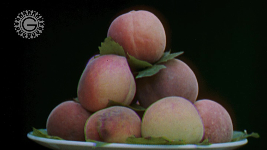
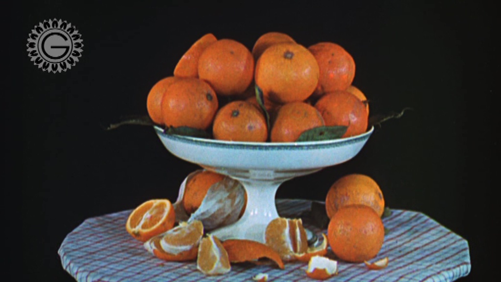
Flowers shows a series of arrangements. The tulle bedecking one of them would have been difficult to get right with hand-applied or stencil-applied color. Fruits follows up with oranges, peaches, as well as some eggplant and tomato. Of these, I think the peaches would probably have been the most impressive as the blending of the orange and red on the fruit’s skin could not have been easily accomplished with applied color. The slow turntable present in each shot confirms that, yes ma’am, these are indeed motion pictures.
(I have to say, though, that I had a bit of a chuckle about tomatoes and eggplant included in Fruits. I realize that “fruits” likely meant “fruitage of the land” but I was also amused by the image of a pre-WWI French filmmaker deciding to play a little prank by reopening the scientific vs culinary debate.)
Fruits and Flowers have no plot between them and they didn’t show the intended audience anything they were not already familiar with. Oranges, peaches, tomatoes, lovely flower arrangements… all well-known sights. The familiarity itself would have been advantageous; we know what oranges look like and can easily see that Chronochrome’s shares are accurate. In fact, these films illustrate what Gaumont always did very, very well: the marketing side of their technological accomplishments.
Chronochrome was at its best in closeups and in a studio setting. In Silent Cinema, Paolo Cherchi Usai points out that the process could turn muddy in sunlight and longer shots could turn blurry. You can see this in the Chronochrome film Provence: The Old Village of Annot. It still looks impressive but doesn’t have the visual pop of Fruits and Flowers. This problem was also noted in 1921, when Gaumont attempted to revive the color process. Educational Film Magazine stated that, “chronochrome films, however, were not all entirely true to nature, and this was especially noticeable in films showing landscapes with moving figures. Many of the pictures looked like chromo-lithographs.” The magazine did heavily praise the process overall, particularly its studio-bound presentations.
Displaying technology to its best advantage may seem obvious but many an advance has been abandoned due to poor marketing and a failure to communicate its value. I would argue that Gaumont’s Phonoscène was more successful than Edisons Kinetophone sound process because Gaumont better understood the technology’s limitations and worked within them, emphasizing music and celebrities over squawking attempts at comedy skits.

If you fire up Google today and ask about “first color film,” the featured movie that will appear in the sidebar is currently The Wizard of Oz. (Beats head against table.) But if you look up more reliable sources, you will probably hear about Turner’s color process. And, no, it’s not Ted Turner’s hideous colorization attempts from the 80s.
Edward Raymond Turner was working on a way to capture natural color and project it on the screen. He experimented using his young children as models but he died suddenly before he was able to refine his work into anything that could be properly released to the public. His films were recently rediscovered, restored and screened. So, he was first, right? Well…
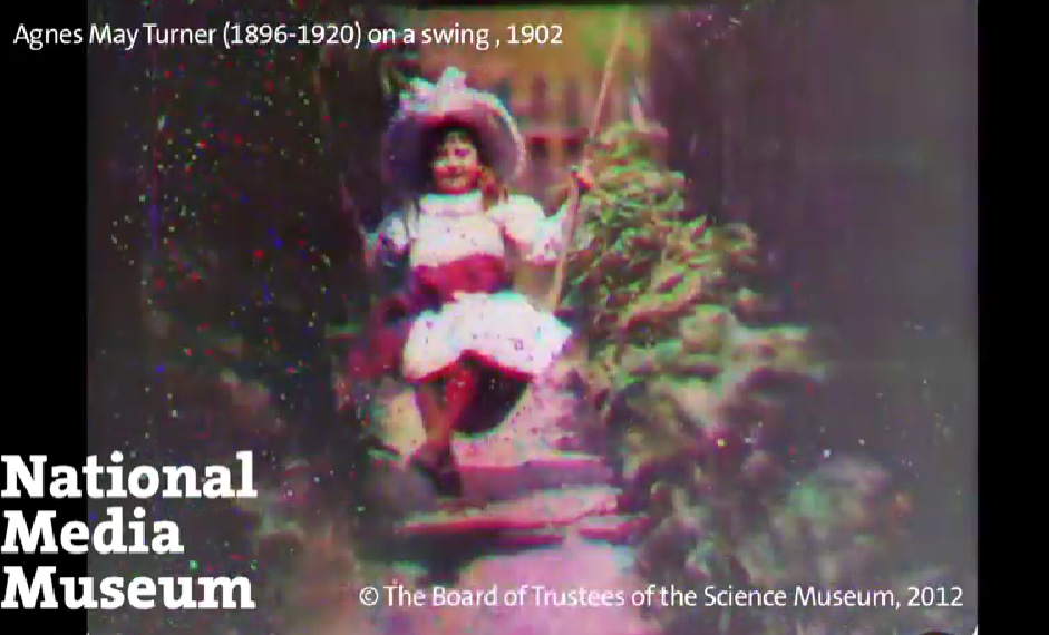
Now, Turner’s color films are impressive—thanks to modern technology that allows us to view them without developing migraines or nausea. Projected on the original equipment, they were smeary blurs. Much like Thomas Edison’s Kinetophone sound technology, Turner’s work is better now than it was when it was released. But where Kinetophone was merely fussy, Turner’s color movies were well-nigh impossible to view on the equipment of the time. The modern images we see were not accomplished with his original equipment or recreations or any analog device but, rather, digitally with Adobe Photoshop.
This is where restoration can be a little bit deceptive. Usually, restorations make films look as good as they did when they were released but in the case of Turner, they look far, far better than they ever did when they were initially made. That’s perfectly fine and even desirable. I like seeing these early images, but I do think the phrase “commercially viable” is very important here, as is “commercially successful.” If a process was never stable enough to leave the lab, its firstiness has to have a huge caveat stamped onto it. Turner’s color films are important, they’re fascinating, they’re wonderful to see but, to the vast majority of the population in 1901-1902, they may as well have never existed and that fact matters.

(There are similar issues with dewy-eyed descriptions of silent movies teaching the world to listen to good music. Yes, certainly, at the finest and most expensive theaters. But a great many movie fans had to sit through off-key renditions of standards performed by indifferent and underpaid musicians at cheap theaters. Of course, we want to hear the best score possible when we watch a silent film but we need to acknowledge that silent movies were not always given such a presentation.)
George Albert Smith’s Kinemacolor was the successor to Turner’s experiments and it is generally considered to be the earliest commercially successful process. Like Kinemacolor, Chronochrome was a natural color process but not a natural color film. The Timeline of Historical Film Colors has a much more detailed explanation but the short version is that Chronochrome used a system of filters (blue, red, green) on both the camera and projector to achieve its rich palette with black and white film. (This was similar to Turner and Kinemacolor, though the latter used only two filters, red and green.) The Chronochrome process could not be run on a standard projector. And, like all natural color film of the time, it was fussy as all get out. It also required projecting onto a pale yellow screen in order to look its best. Further, wear and tear on the prints rendered them unusable quickly.
Chronochrome was commercially viable and did continue to be used and revived but Kinemacolor was earlier and its success is generally seen as the start of natural color in the movies. Kinemacolor could also be run on a standard projector with a few attachments and adjustments, making it a cheaper color option for theaters. In the field of color, Gaumont fell into the same trap that had tangled Edison’s sound attempt: too much work and expense for too little return.
Incidentally, you may notice that the aspect ratio of these screencaps is a bit more modern and rectangular than we usually see in films of this era. The image was not cropped or resized. Rather, the Chronochrome projector was better able to line up its filters with a shorter frame.
Chronochrome has been essentially forgotten as the decades have passed with Turner claiming first, Kinemacolor being the commercial winner and Technicolor finally winning over Hollywood. However, the silent era was a time of exciting experimentation with sound and color being considered the greatest prizes. Seeing full-color images that are well over a century old will never lose its thrill.
Even if tomatoes are not fruit.
Where can I see it?
Released on DVD as part of the two-disc I colori ritrovati set from la Cineteca di Bologna. This Italian set subtitled in English and the booklet is dual language but it is a region 2 PAL, so you will need to make sure you can play international regions before purchasing in you are in North America. The set covers Chronochrome, Kinemacolor and the Pathé stencil color process.
☙❦❧
Like what you’re reading? Please consider sponsoring me on Patreon. All patrons will get early previews of upcoming features, exclusive polls and other goodies.
Disclosure: Some links included in this post may be affiliate links to products sold by Amazon and as an Amazon Associate I earn from qualifying purchases.

“Turner’s color films are important, they’re fascinating, they’re wonderful to see but, to the vast majority of the population in 1901-1902, they may as well have never existed and that fact matters.”
As a recovering epidemiologist, I know how important precision of definition is. Your meticulousness is very welcome in that regard.
Wow! The so called silent era never ceases to surprise me.
Fascinating stuff – and based on those stills very impressive results. I’d seen the Turner clips on YT – and been dutifully impressed until, as you point out, it dawned on me that the process didn’t work at the time, so to some extent the claims being made for it were a bit of a cheat (I was reminded of a short story I read years ago where Leonardo Da Vinci was cited as the inventor of the first animated film – which involved the viewer running very fast past multiple paintings of the Mona Lisa breaking into a grin – unfortunately only one frame still remains…)
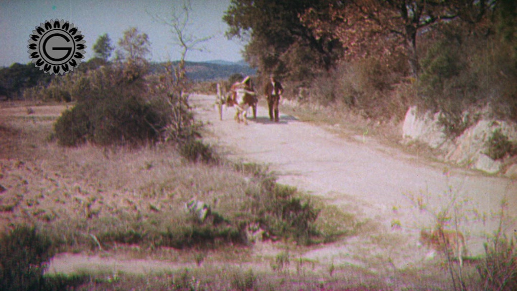
There’s a UK Channel 4 series on WWI (available on DVD) – and it includes color footage of French troops at the outset of the war in 1914 – but no information as to sources. Given the time and location is that likely to have been Chronochrome?
P.S. And finally, even though it annoys most of us – the science is in – eggplants and tomatoes are both fruit!
Hi there. I will have to look at the footage but it’s quite possibly stencil-applied color, which was far more common. The edges will be much sharper than in natural color.