William S. Hart is a Good Bad Man again, this time fighting bandits in 1880s Arizona. A typical tale for him but stylish cinematography and a dark tone lift this picture considerably. It was lost for decades but has recently been reconstructed.
Home Media Availability: The restoration has not yet been released on home media but the 9.5mm condensation is available from several sources.
How did they make their Letters in 1881?
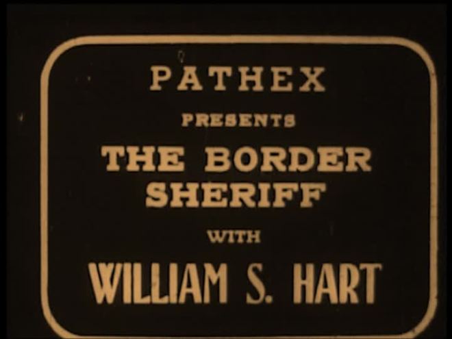
I have never made a secret about my love for a good William S. Hart western and his films have a rather high survival rate, though the quality of the prints varies. However, there are still some titles that are gone forever. The Gun Fighter looked like it was in that unfortunate category. 9.5mm condensations have been circulating among collectors for years but the bulk of the footage and all the original title cards have been gone for almost 100 years.
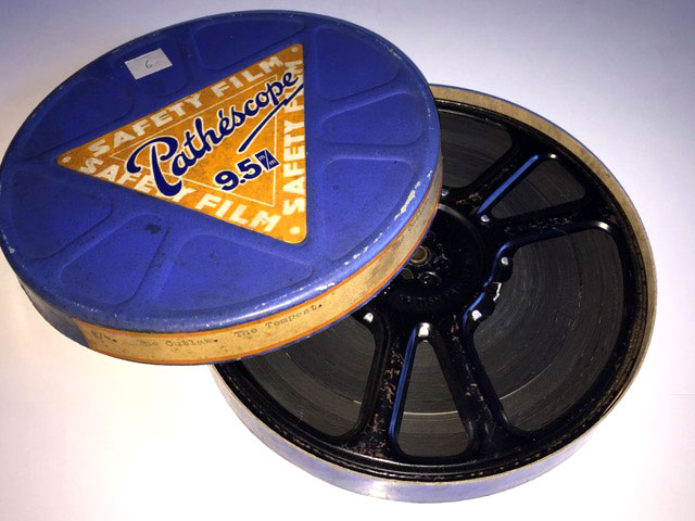
Until now. Film historian Kevin Brownlow discovered that a reel and a half of tinted nitrate survived in the holdings of the Cinémathèque suisse and with that new material, would it be possible to reconstruct the original continuity? In addition to the Swiss material, the film’s original scenario survived and assorted 9.5mm cuts were held by Brownlow, editor and director Christopher Bird and archivist Dino Everett. Two Pathex, or American 9.5mm releases and two Pathescope, or UK 9.5mm releases. (You can read more about 9.5mm technology here. It was essentially the viable first home video.)
Each condensed cut was created by a different editor and so different scenes, different portions of scenes and even different takes might be used. So, with this material in hand, the restoration was undertaken in early 2019 in the hope that it would be screened at the venerable Pordenone Silent Film Festival. Editor Chris Bird took on the challenge of making sense of all the material, recreating a coherent narrative and matching the tints of the beautiful original nitrate.
And this is where I enter the story. I work in graphic design and marketing as my day job and had worked with Chris on producing a release of Kidnapped, another forgotten 1917 film. Chris sent me an email asking if I knew of a modern typeface that would match the look and feel of what the title cards of The Gun Fighter would have originally looked like. There really isn’t anything that does the job precisely, at least to my knowledge. Hart films of the period used very distinct hand-lettered typography and we don’t have anything like it today.
So, I offered to recreate the original font using modern design technology. It was quite an adventure.
(Oh, by the way, the question of whether the film is The Gun Fighter or The Gunfighter is still open to debate. I opted for the former because I have been using it in other coverage of the film but I am not entirely sure that there is a correct answer. Use whichever version you like.)
One more thing before we get started. Here are the credits found on the restoration because I want to give everyone a shout out. Please give everyone involved a big hand!
Print sources
CINEMATHEQUE SUISSE, DINO EVERETT, KEVIN BROWNOW, CHRISTOPHER BIRD
Scanning by
CINEMATHEQUE SUISSE, USC HUGH M. HEFNER MOVING IMAGE ARCHIVE
DCP
PATRICK STANBURY
Original font, titles and graphics recreated by
FRITZI KRAMER
Produced by
CHRISTOPHER BIRD & KEVIN BROWNLOW
The Film
The Gun Fighter is not William S. Hart’s most famous film. I dare say it’s not even in the top ten. Obviously, part of the reason for this is that it was only available in a severely cut-down format but I think modern audiences will be thrilled by its dark streak.
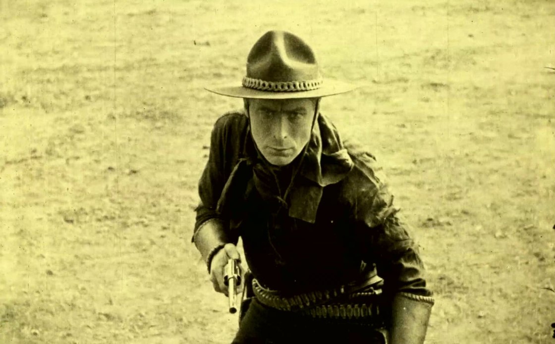
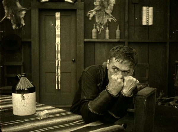
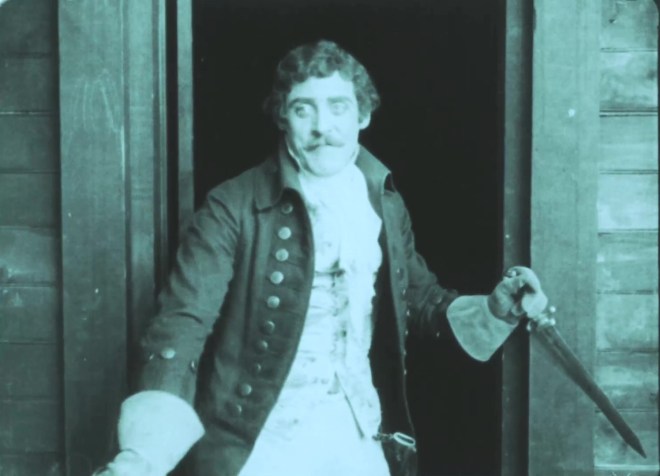
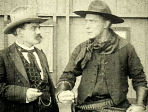
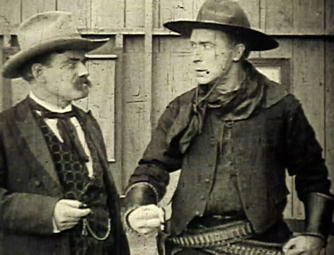
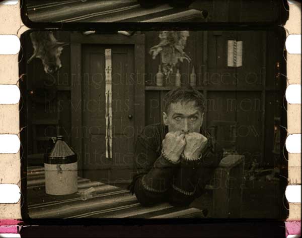
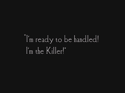
Hart plays Cliff “the Killer” Hudspeth and is referred to mostly by that moniker throughout the film. It’s set in the Arizona Territory, the year is 1881 and the picture opens with a closeup of a pistol pointing right at the audience.

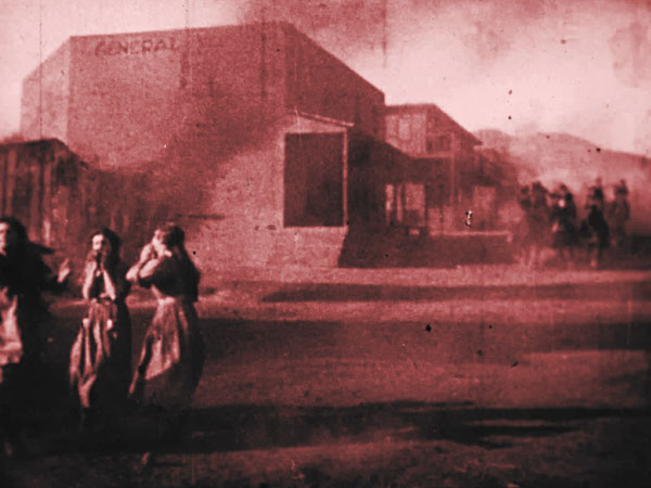
The Killer is engaging in target practice and vowing vengeance against rival outlaw El Salvador (Roy Laidlaw). El Salvador’s gang has been terrorizing a nearby town and the Killer shows them what’s what by shooting one of them.
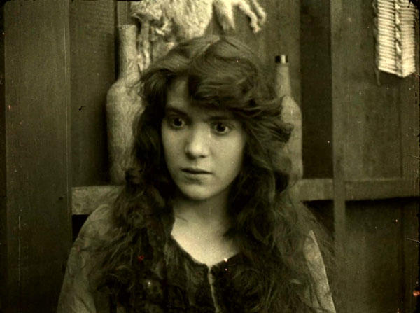
The local seamstress, Norma (Margery Wilson), witnesses the shooting, calls the Killer out for it and is he ever steamed! It strikes me that he should have been more used to this kind of thing if he wants to call himself “the Killer” but there you have it. He grabs Norma and rides off with her, which, again, overreaction.

The Killer then has a change of heart when Norma discovers his kill list and a photograph of his mother. She tells him that he should try to be the boy his mother loved and he feels terrible, promises to stop killing and returns her to town. Once there, the local law has arrived with a proposition: the Killer will have legal sanction to hunt down and kill El Salvador. Now who could refuse an offer like that? Promise or no promise, the Killer is off to kill again. Which is probably a good thing because otherwise he’d have to change his name to “the Flesh-Wounder” or something.
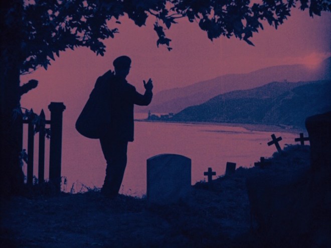
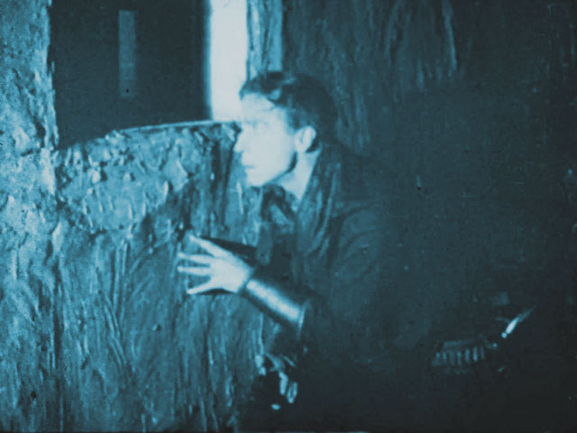
It’s very standard Hart fare but everyone is enthusiastic and Margery Wilson does particularly good work as Norma. (Wilson was a director in her own right but her films are lost.) But it’s the cinematography that really puts this one over. Venerable cinematographer William H. August creates moody shadows, gloomy rainstorms and flashfloods and the climax of the picture features a gunfight in the dark punctuated by flashing bullets. Wowsers.
Hart directed himself in this picture but, interestingly enough, his performance is more restrained than in other films of the period in which he was directed by others. He is dramatic, certainly, but he doesn’t let it get out of control and he doesn’t feel the need to weep for the camera constantly, unlike other pictures I could mention. (Glares at The Whistle.)
The film does contain several rather unfortunate title cards and casual anti-Mexican slurs are thrown around at a high rate even by the standards of the period. It’s a shame because this content mars a film that has so much going for it otherwise. (That being said, there was never a question of removing that content for the restoration. Those title cards existed and erasing them would be cowardly and dishonest. The long and the short of it: please consider this a content warning.)
In general, though, this film is brooding and exciting, the kind of 1910s western that makes fans of silent era westerns very, very happy. I like to say that westerns of this period were revisionist before there was anything to revise and with a few minor tweaks, this could have been made in 1960s Italy with Lee van Cleef.
While researching The Gun Fighter during the restoration, I discovered that it pretty much flew under the radar on its initial release as well. Theater owners wrote into trade periodicals to say that the picture drew crowds and was a moneymaker, even proving to be strong box office when it was re-released a year later. While critics acknowledged that the picture was exciting and beautifully shot, they also described it as following “the usual course of a Hart picture” and that Hart was doing the “bad-man-who-reforms stunt” yet again.
I mean… They’re not wrong. It’s true that Hart did return to that particular well quite often but this movie is a particularly good version of it. It’s certainly better than either Wolf Lowry or Blue Blazes Rawden, both of which were released around the same time and both of which sunk into maudlin mush. Buster Keaton, a Hart fan, stated that Hart turned sappy and that ruined his pictures. While Hart did indeed lean into his Gilded Age upbringing and bring on the tears more and more as his career progressed, he was still able to turn things dark, nasty and bloody when he was in the mood. The Toll Gate, for example, is one of his very best.
(By the way, the idea that Keaton and Hart had a feud going is a myth. Keaton complained because he cared.)

The Gun Fighter deserved to be restored on general principle: if you have the ability to put a silent film back together, it’s the right and noble thing to do so. But the film also deserved restoration because it’s a very good Hart vehicle that has never really received the attention that it deserved. This restoration would finally give it an opportunity to shine.
The Ethics of Restoration
When restoring a film, the goal should always be to make it look as much like it did during its original release as possible. However, there are some aspects of silent film restoration with no easy answers. I ran into these issues with Kidnapped, which survived as a 16mm black and white print but was originally tinted (splices showed this to be the case) and required tints for day-for-night shots to make sense. But I did not know the original color scheme and so Chris and I made educated guesses based on colors used at the time.
Some restorers feel that unless the original tint scheme is known, it’s not right to tint a film. There’s no right or wrong answer here and it makes a fun, geeky discussion but nobody is going to agree 100%. In the case of The Gun Fighter, the footage from Switzerland was tinted and thus provided a guide as to the look and feel of the film’s color scheme (or at least one of them). With that information, it would be a shame NOT to re-tint the entire restoration in this style.
As for the title cards, it was decided that since the original decoration was not known, they would simply be text on a solid dark background. Hart’s films generally had beautiful and elaborate art on at least some of the title cards but they were not the same from film to film and it would have been impossible to say what the originals would have looked like with any certainty.

Every single silent film reconstruction is a series of questions like these. Do you restore stencil tints if the original had them? Full tints? Title card art? Again, no right or wrong answers here but a lot of thinking and pondering and questioning. This is not an activity for anyone bored by deep design discussions.
Personally, I am extremely liberal in my restoration views and am all for adding in tints and playing with the design if the original doesn’t survive. Other people feel differently and their concerns are quite valid. Unless we’re dealing with something on par with The Phantom of the Opera, most silent films get only a limited number of restorations, maybe just one. It’s important to get it right.
We’ll be digging into the grit of the process and we’re going to be getting a bit technical. I will try to keep the jargon to a minimum but there are some areas that require a bit of nerdiness, so please stay with me!
In which we learn the editor’s craft
The biggest job in the restoration was the process of cobbling the film together from five different sources and two different film gauges and seeing if the result would be in any way comprehensible. That was Chris Bird’s responsibility and while he is experienced in the art of silent film reconstruction, this was still a challenge to his skills. Chris explains some of the challenges:
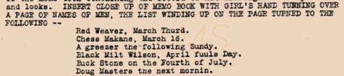
“The 9.5mm versions were issued early in the 9.5mm era, when they were cutting films down really brutally – the 9.5mm versions run only 180 feet, around 10 minutes. These cut downs are so short that I didn’t bother with them when I started collecting. But a lot of Triangle subjects only survive in this short 9.5mm form. It was actually difficult to cram in the replacement title cards with so little footage to work with. So, in some cases two titles were combined into one, and in one case I had to repeat a shot in the climax – there wasn’t enough material to sustain it as it was.”
In cases where there simply was not enough footage to paper over holes in the plot, a simple title card that read “Missing Footage” was added to explain the gaps. Of course, this was a worst case scenario because these cards bring the viewer out of the film.
“The ideal is to have as few ‘Missing Footage’ cards as possible. There was an audible gasp of disappointment during the Pordenone show when the third of these came up, right in the middle of the climax. Overall, I was genuinely surprised that the two fragmentary 9.5mm versions, combined with the one and half reels of nitrate, gave me enough to tell the story with.”
“Technically there should have been very many more ‘Missing Footage’ cards, based on what I knew was missing from the script. I only resorted to these when the narrative made no sense without the cards. This is a matter of personal taste – some restorers would flag every fragment of missing material, but I am very concerned that the film still has to play AS A FILM as much as possible.”

The narrative is indeed complete. It moves along at a much faster pace, naturally, but most of the character beats are present. Fortunately, the Swiss nitrate material contained the introduction of Norma the seamstress and established the contentious relationship between its leads. This is essential information if the audience is to understand Hart’s sacrifice at the end. The showy climax is quite fragmented, unfortunately, but the main character moments are intact.
“It is a total jigsaw puzzle! In total, there are 196 edits I made to the film, the vast majority of which are cutting from one source to another, including titles. Because the 9.5mm version were made by different editors, they made different choices of what to include. This meant in practice they often used different, shortened, portions of the same shot in the two versions, and it was possible to cut the two back together again! Sometimes this is fairly seamless. These two frames are the join between British and American 9.5mm prints – the shot was truncated in both, but I was able to recombine it. (Note the scratches differ between the two frames, indicating the two different sources):”

Here’s another example:
“In one case the join was rather more obvious, as the two bits didn’t overlap. I disguised this a little with a change of tint, as was sometimes done in this situation. They are opening the door from the amber tinted saloon interior, to the red tinted exterior.”


“The choice of what to include in the two different 9.5mm versions is interesting. The American version gives us what little survives of the climax. Then again, the English gives us the only surviving material for the opening, including the gun being fired into the camera, a la Great Train Robbery, Spellbound, and Magnum Force.”

“I left the nitrate as I found it, with one difference. All the nitrate titles were tinted pink. This does not necessarily indicate that the American prints were made this way – this would have been a local European decision. Because the reconstruction is so fragmentary anyway, I decided instead to tint your replacement titles to match the surrounding footage, in the more usual practice. The 9.5mm prints were both black and white, so I added conjectural tinting of my own.”
It is quite possible that the titles were tinted pink as an anti-piracy measure. I have seen European prints with green and red title cards, which would naturally turn black and white when duplicated. Cutting in colored title cards would have made piracy considerably more expensive and a lot more trouble.

In any case, the color scheme of the Swiss material is stunning and tidily solved the mystery of which colors to use in the restoration. It should be noted that the original American release prints might have had an entirely different tinting scheme but while the surviving nitrate might not have been THE original tinting palette, it is definitely AN original tinting palette and a most attractive one.
What’s the “original” font anyway? (With bonus plot twist)
And so this is where I enter the story. There was always the option to just use Caslon, a fine and authentic typeface, but for something like this, why not go for an authentic reproduction of the original look of the title cards? As stated before, the cards were long gone but we could do our very best with the available information.

Why didn’t The Gun Fighter have its original title cards? Well, obviously, the foreign release print found in Switzerland had translated title cards—French in this case—so that the local audiences could enjoy the film under the title Le Justicier. And even though the 9.5mm releases were originally in English and Murican, they too did not have the original title cards. 9.5mm releases were almost always condensed down in order to keep costs and reel changes low. When a film is condensed from, say, five to ten reels down to one or two, it is inevitable that new title cards would be required. And in some cases, collectors added their own title cards to their prints in order to spice things up.

The original scenario exists with all of the title cards neatly included, so the actual content of the cards was not a mystery. Many restorations have not been so fortunate. The original script is gone and all that remains are translated title cards and who is to say how accurate that original translation work was? Having a real screenplay with real title cards is a luxury.
What was a mystery was the look of the cards. Were they decorated? Highly likely. How? We don’t know. What about the typeface? We don’t know.

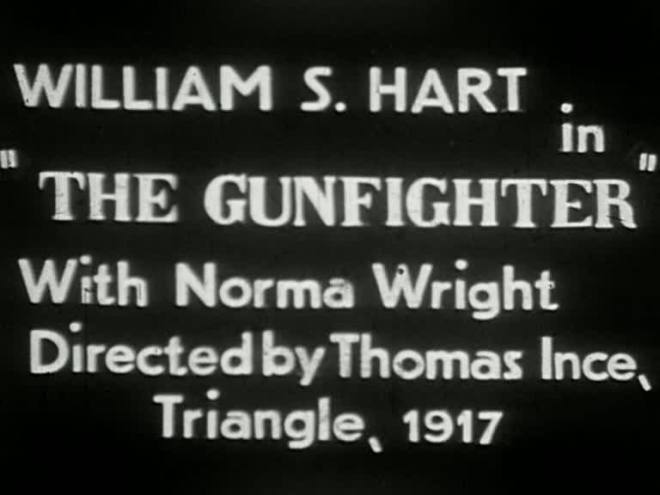
In cases like these, it’s best to look at other similar films for clues. Many of Hart’s films made just before and just after The Gun Fighter survive. Perhaps one of them could be the design source? Historian Richard Koszarski suggested that fragments of Wolf Lowry, a Hart film made the same year and held by the Library of Congress, could provide the correct look for the typeface.
These cards and the quality scan were valuable but provided just a portion of the alphabet. Some letters are used more frequently than others, you see, and so Wolf Lowry contained beautiful examples of upper case Ws and Ls and Ts and As but other letters (for example, an upper case J) were not present in the surviving footage. Fortunately, an italic form of the same typeface was used in the Hart film Blue Blazes Rawden and while the available print is a bit fuzzy, it did fill in some of the gaps.

There were a few letters that I had to create out of whole cloth, though. In these cases, I carefully examined the features of known letters, made some sketches and tried my best to create letters that sat harmoniously with the others. Harmony is the most challenging aspect of font creation. The other headache is tracking and kerning (space between the letters).
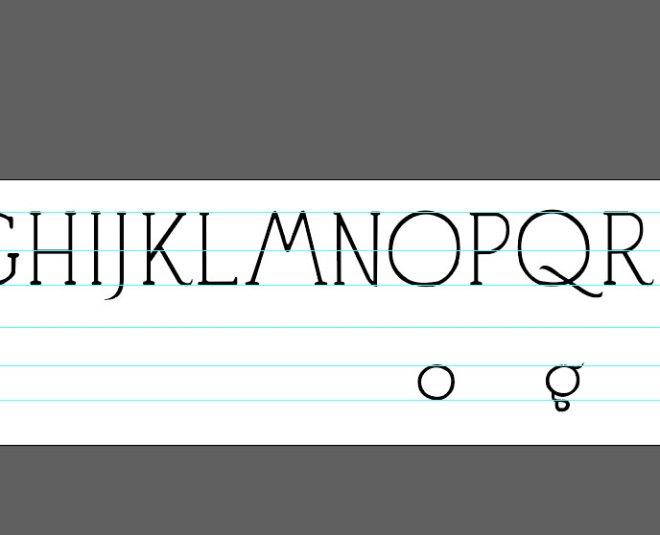
I traced the letters using the pen tool in Adobe Illustrator and avoided using lines because I did not want the shape to be entirely uniform and even the calligraphic setting for the lines looked a bit too machine-made. (I am sorry if that was too nerdy but long story short, I did this the long way.) Original title cards were hand-lettered and I wanted to retain that imperfect, hand-crafted look, which I feel is an essential part of the appeal of silent films, especially silent films of the 1910s. Maintaining consistency in thickness, shape and other elements was a constant challenge, as was avoiding a temptation to make things too perfect.
That being said, tracing was a cakewalk compared to fixing the way the letters and punctuation marks interacted. Anyone can create letters but getting the spacing right is what separates the cats from the kittens. I used the Fontself plugin to convert the letters into a usable computer font file and began tweaking the placement, creating punctuation, etc.
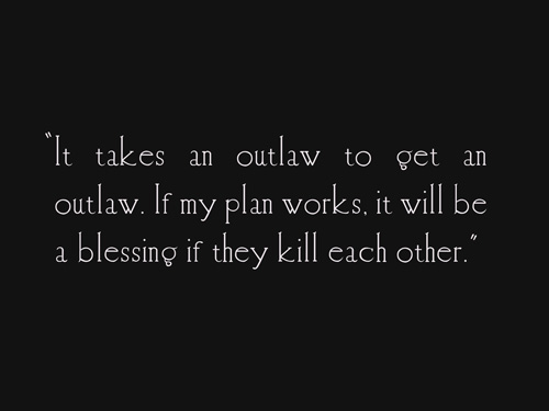
I was pretty well along in the process when a shocking discovery was made in the surviving nitrate film. While editing the material together, Chris had came across the only surviving evidence of the film’s original title cards, a single frame that had not been snipped out with the others a century ago.
The card in the frame, almost imperceptible because it was from the start of a dissolve, showed that The Gun Fighter’s title cards matched the font of Wolf Lowry’s title cards exactly.
And that, dear reader, is the restoration equivalent of a hole in one. And even better, it provided us evidence of the correct spacing, layout and general look of the cards. That little frame may as well be made of solid gold. It didn’t have any visible title card artwork but any scrap of information is welcome in a case like this.
How did the frame survive? That actually gives us some insight into the filmmaking process and it’s quite interesting. Chris explains:
“Basically, it was standard practice to finalize the titles later, during the editing process. But it was also standard practice to make any effects like fades and dissolves in camera, as you kept picture quality higher by not needing to drop down a generation by combining two pieces of film later in the process. So in practice this meant that the title card had to be finalized in advance, including the actual finished physical title card itself. This would have to be available on set for the cameraman to fade out on Hart, then wind the film back in the camera, and fade in on the title card as his next shot.”
Of course, this creates another minor mystery because silent films generally had a second camera grinding away for the foreign market and why bother making dissolves for English titles on a foreign print? Perhaps there was enough of an overseas English speaking market for the dissolves in the second camera to be worth the trouble. The Gun Fighter was released prior to the United States entering the First World War so the troops are not the answer but Britain, Australia, New Zealand, etc. would likely have enjoyed a good western.
Whatever the reason, the dissolve was made and the frame exists and that’s all that matters.
So, with the font and layout settled, I created the cards themselves. Chris provided the text from the screenplay and I made the cards in Photoshop. Because pure white text on pure black backgrounds would not catch the tinting properly, I used shades of grey to grade the cards so that they would match the tints of the surrounding footage. I saved them as TIF files (which are uncompressed and do not have artifacts—those weird boxes you sometimes see in JPEGs) and sent them over to Chris, who cut them into his edit of the film.
I must say, I was quite amused by the number of ways producer Thomas Ince found to credit himself in the opening titles of Blue Blazes Rawden, which was my source for designing those same opening titles in The Gun Fighter. (The cast and crew list was based on the AFI catalog.) You may recall that Buster Keaton spoofed Ince’s tendency for credit hogging in his comedy The Play House.

And Chris and I had quite a time differentiating between intentional typos meant to mimic cowboy slang and actual misspellings! But wherever possible and even when the original cards were… well, problematic, everything exists exactly as typed out in the screenplay.
Wanted: One Wanted Poster
As the film was reconstructed, it became clear that more material was required to create a cohesive narrative. There is a scene in a bar in which one of El Salvador’s men sees the Killer’s wanted poster on the wall and shoots it to show that he is not afraid of him. Alas, there was no footage of the original wanted poster in any of the surviving material.

However, the screenplay did have detailed information on the content of the poster including hand-written notes with further details. But what should it look like? And the screenplay called for it to include “a detailed description of Mr. Hart,” where would we start with that?
Ah, but we had an important resource: the Library of Congress has the 1914 Hart film The Bargain preserved on a paper print and the film contains a wanted poster that has, you guessed it, a detailed description of Mr. Hart. Obviously, the poster from The Bargain also provided an example of appropriate and authentic graphic design.
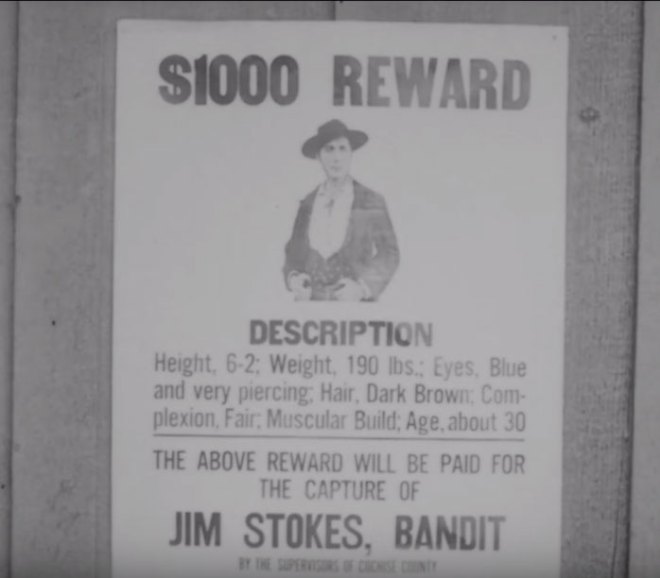
Armed with the poster from The Bargain, the screenplay and a still from The Gun Fighter, I made some versions of the wanted poster, Chris chose the one he liked best and I refined it from there. I researched real 1880s wanted advertisements and posters as well. My goal was not to make an authentic 1881 wanted poster but to create 1881 as perceived by a graphic designer of 1917 and I watched several period westerns to make sure that my instincts were correct.
Real wanted posters were simple in their design and dense and heavy with their text. The simple WANTED FOR MURDER posters were a movie invention and became ubiquitous but at this point in film history, at least some posters were conveying a lot of information to the audience. The one change that I did make was to cut the description of Hart as thirty years old. It was a choice between authenticity and suspension of disbelief and Hart clearly was on the shady side of fifty.
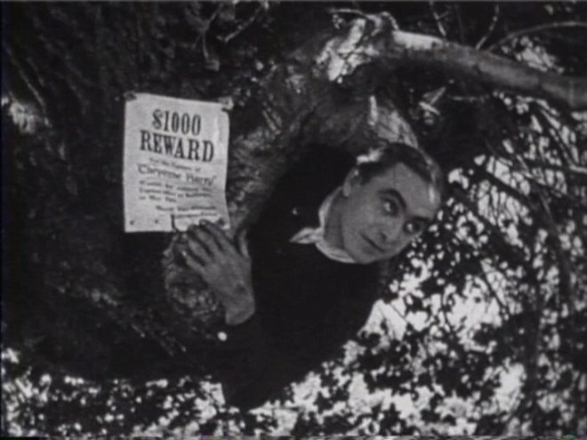
Finally, the bar in the film had distressed wood walls. In order to give my poster an authentic background, I made use of a cabinet with a natural matte finish and attached a piece of paper to it. (My love of mission style furniture finally paid off!) I then overlaid my poster design in Photoshop and created a title card with the correct aspect ratio. Chris added a bit of film jitter to the image so that it would blend in with the motion picture footage surrounding it.
I jokingly offered to add real bullet holes but we did not end up painting the lily in that manner. (My father could have used a printout of the poster for target practice with his authentic six shooter.)

The old lady that got away
As part of the process, I also created a letter and a journal entry for the film. These were made with existing script typefaces because I simply ran out of time to hand-letter them to my satisfaction. The journal background was the pioneer diary of my great-great-great-grandfather as he made his way to Missouri by wagon, so the background was period authentic.

There is also a brief scene in which Margery Wilson discovers a photograph of Hart’s mother and uses it to remind him of his more civilized past. The original cut of the film would have inserted a closeup of the photograph, of course, and I am reasonably certain that the mother would have been played by Gertrude Claire, Inceville’s resident mom actress. Unfortunately, we were unable to locate a still of Claire and reusing material from another film would have been risky as it could potentially be more distracting than having no close-up at all if the audience were to recognize it.
So, in the end, we opted to forgo the closeup of the photograph. However, should a still of Claire or a similarly suitable performer turn up, it would certainly be an option to cut it into the film.
Down Argentine Way…
At Pordenone, Kevin Brownlow informed Chris that he had discovered yet another 9.5mm cut, this one intended for the Argentinian market! What will it contain? Different shots? Extended cuts of existing scenes? Material that has been missing entirely? Maybe all of these things and maybe nothing at all but the possibilities are endless. Oh, and the film was called Fuera de la Ley in Argentina. It’s now in the capable hands of David Glass for scanning, so we shall see what comes up!
And that’s what happens with reconstructions: discoveries often inspire more discoveries. Who knows? Maybe some more nitrate material is out there too. Check your attics, basements, eccentric uncle’s stash and your friendly neighborhood Soviet era archives.
Where can I see it?
The Gun Fighter has not yet been released on home media but other screenings are in the works. I hope it will soon be possible for everyone to enjoy this most Harty western. If you want a sample of the picture, both Grapevine and Harpodeon have released the edited down home media version.
☙❦❧
Like what you’re reading? Please consider sponsoring me on Patreon. All patrons will get early previews of upcoming features, exclusive polls and other goodies.
Disclosure: Some links included in this post may be affiliate links to products sold by Amazon and as an Amazon Associate I earn from qualifying purchases.

Those titles are spectacular and so atmospheric! Well done! And it’s very moving to get a sense of the work involved in rescuing these treasures, not to mention the excitement of your discoveries and the challenges solved! Thank you so much for your work and your write up.
Thank you so much!
Congrats to all involved. This looks superb. I am a William S. Hart fan too. Any information regarding availability of Truthful Tulliver (1917)?
Thanks! I’m afraid there’s no home edition that I know of, though several prints survive:
http://memory.loc.gov/diglib/ihas/loc.mbrs.sfdb.1372/default.html
thank you, hoping the Netherlands EYE films will put it on YouTube,
Fascinating!
Congratulations — and thank you — to you and all who put so much effort and thought into the project.
Thank you!
I give my tremendous thanks to both you and the whole restoration team for your hard work and dedication towards rescuing the film!
Random question, will the typeface for the reconstruction be made available for public use, ala the font made for the restoration of The Good Bad Man?
Hi there. Because of the condensed timeline of the project, the font is not totally finished. I put it in a usable format for myself but it still has eccentricities and I didn’t make numbers or the kind of diacritics one would expect in a professional font file. I would definitely like to make it available at some point but for right now, it’s such an eccentric little thing that I am pretty much the only one who can navigate the string and chewing gum holding it together.
Thank you Fritzi for all you do to preserve and promote silent film.
😀
Loved the detail in this article. You’ve come a long way since you first began this site to now being a key person in all things Silent. It must be so exciting to be part of the restoration process.You are such a star! Still love reading your reviews of course, I can’t wait for each new one. All the best!
😀