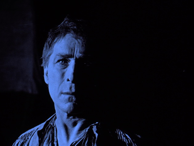
The Pordenone Silent Film Festival is just a few days away and while I am not going to be there myself, a movie that I worked on will be screened as part of the program. I am not the producer or the restorer or anything but I did recreate a classic typeface and made authentic title cards!
You can download the festival program here to peruse but the picture you will want to see is The Gun Fighter, a stark William S. Hart western that has been in fragments for almost a century. According to the program, it’s screening at 9:00 on Tuesday, October 8 and the lovely Donald Sosin will be accompanying it. Huzzah!
I’ve already shared this story on Patreon but the short version is this: The film is being recreated with as much surviving footage as possible (it’s about half of its original length). The reconstruction has been created from a tinted, French-titled 35mm print held by Cinematheque Suisse and 9.5mm prints held by Kevin Brownlow, Christopher Bird and Dino Everett, none of which had the original title card design included. However, the restoration team did have the original screenplay, so they knew what the cards were supposed to say.
Chris asked if I could help but nothing modern really had that quirky flavor of the period title cards and so I volunteered to recreate a period typeface based on another Hart film of the period. Richard Koszarski recommended Wolf Lowry as the source and it proved to be a perfect match. Additional letters were culled from Blue Blazes Rawden.
I created the font in Adobe Illustrator and used the Fontself plugin to create a working, typable font. And here it is!

That’s not a title card from the actual film, more’s the pity, but it was a fun chance to test drive the font. I used varying shades of grey because Chris, who is editing the pieces back into a cohesive whole (and doing a stellar job), is also restoring the original tints following the gorgeous Swiss material. Pure black and pure white don’t catch digital tints very well, something to keep in mind if you ever play around with restoration.
Isn’t it a zany typeface? I never would have guessed it would be used for a western but it showed up multiple times in 1917 and 1918 Hart films. My working name for it was Wolf Gunfighter.
Anyway, I am just a small cog in this project but I am proud of what I accomplished and even more proud of what everyone else achieved and I hope you will attend the screening if you are in Italy. If not, watch this space. I will be sure to share any news about future screenings and availability.
☙❦❧
Like what you’re reading? Please consider sponsoring me on Patreon. All patrons will get early previews of upcoming features, exclusive polls and other goodies.
Disclosure: Some links included in this post may be affiliate links to products sold by Amazon and as an Amazon Associate I earn from qualifying purchases.

I like the typeface as per the sample. Clear and easy to read for me.
Thank you!
Most impressive.
😀
Great job, also am happy to see another William S. Hart film restored.
CONGRATULATIONS, YOU AMAZING, WONDERFUL COG !!!
Great job !!!!!
Thank you for ALL you do on behalf of Silents and those of us who love them!